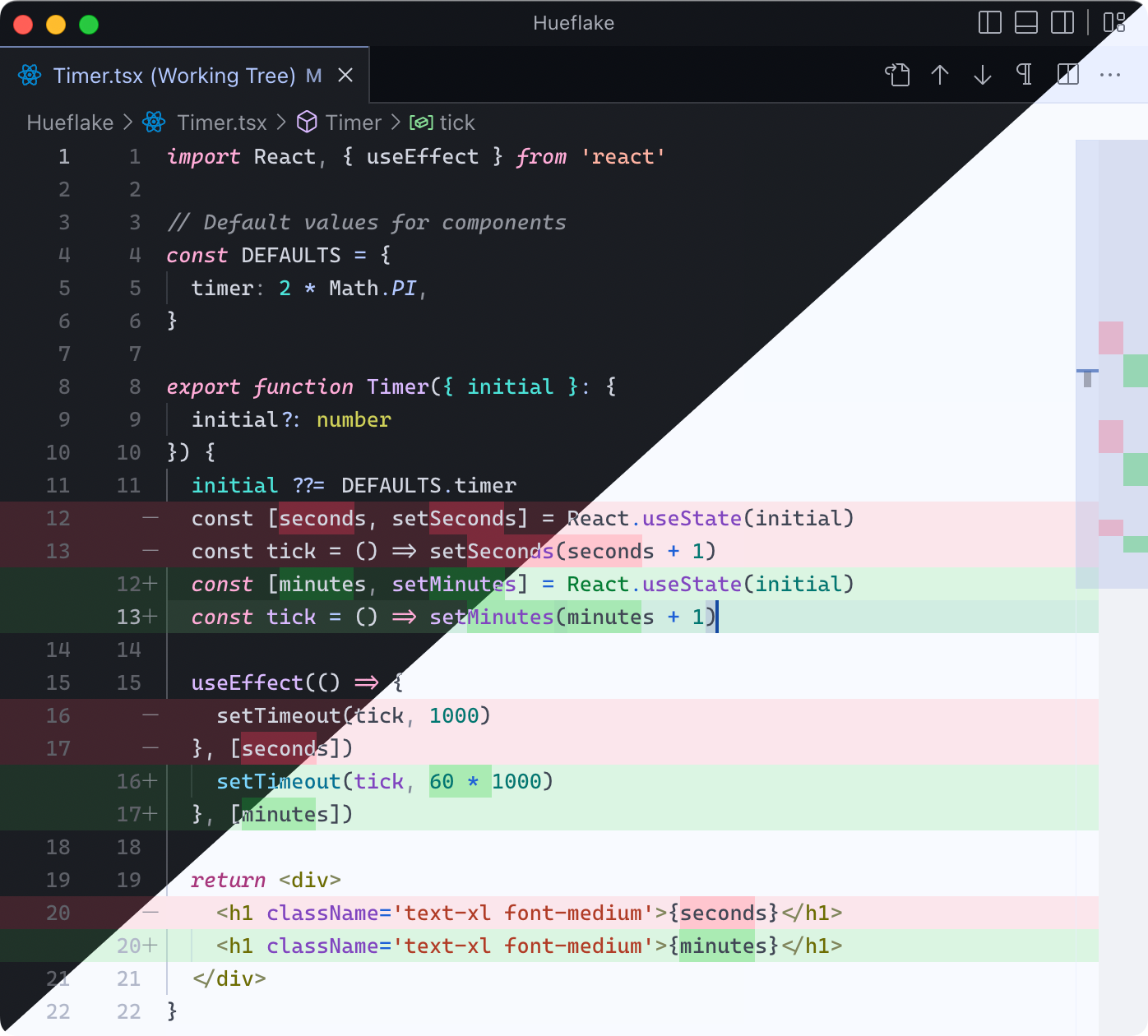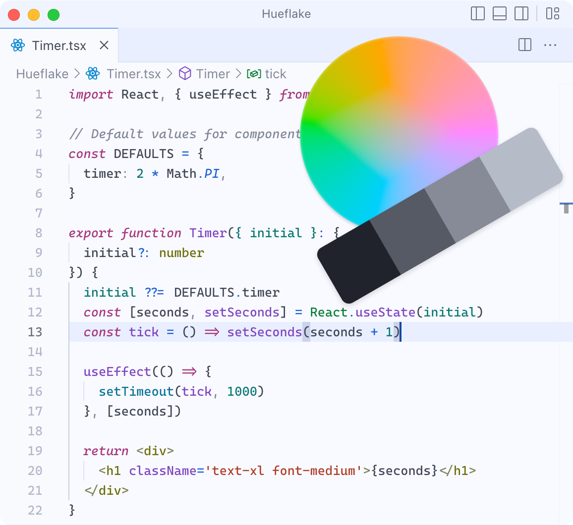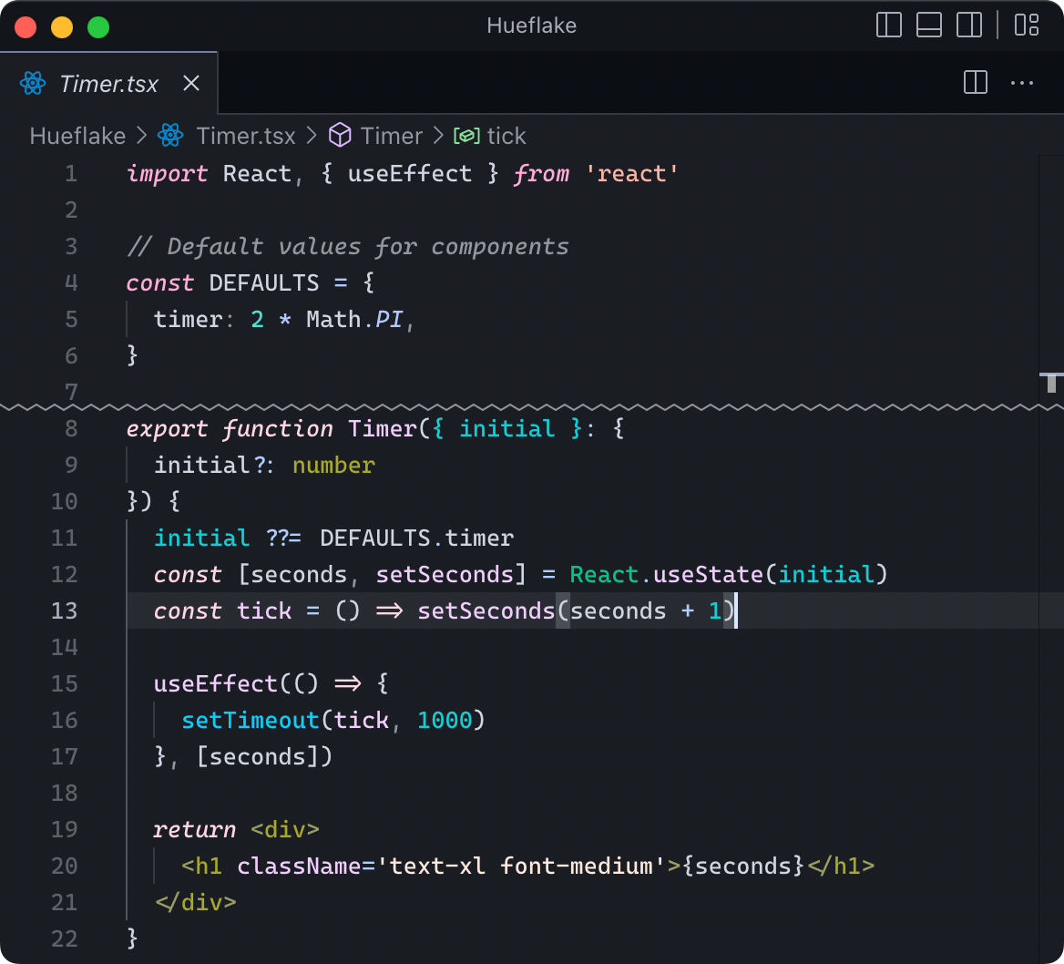

Tired of themes that don’t feel right?
import React, { useEffect } from 'react'// Default values for componentsconst DEFAULTS = {timer: 2 * Math.PI,}export function Timer({ initial }: {initial?: number,}) {initial ??= DEFAULTS.timerconst [seconds, setSeconds] = React.useState(initial)const tick = () => setSeconds(seconds + 1)useEffect(() => {setTimeout(tick, 1000)}, [seconds])return <div><h1 className='text-xl font-medium'>{seconds}</h1></div>}
Anything is possible
Here are just a few themes made with Hueflake.
# Commentdef fn(st: str):return st * 8hi = fn("Hello")
# Commentdef fn(st: str):return st * 8hi = fn("Hello")
# Commentdef fn(st: str):return st * 8hi = fn("Hello")
# Commentdef fn(st: str):return st * 8hi = fn("Hello")
# Commentdef fn(st: str):return st * 8hi = fn("Hello")
# Commentdef fn(st: str):return st * 8hi = fn("Hello")
# Commentdef fn(st: str):return st * 8hi = fn("Hello")
# Commentdef fn(st: str):return st * 8hi = fn("Hello")
# Commentdef fn(st: str):return st * 8hi = fn("Hello")
# Commentdef fn(st: str):return st * 8hi = fn("Hello")
# Commentdef fn(st: str):return st * 8hi = fn("Hello")
# Commentdef fn(st: str):return st * 8hi = fn("Hello")
# Commentdef fn(st: str):return st * 8hi = fn("Hello")
# Commentdef fn(st: str):return st * 8hi = fn("Hello")
# Commentdef fn(st: str):return st * 8hi = fn("Hello")
# Commentdef fn(st: str):return st * 8hi = fn("Hello")
# Commentdef fn(st: str):return st * 8hi = fn("Hello")
# Commentdef fn(st: str):return st * 8hi = fn("Hello")
# Commentdef fn(st: str):return st * 8hi = fn("Hello")
# Commentdef fn(st: str):return st * 8hi = fn("Hello")
# Commentdef fn(st: str):return st * 8hi = fn("Hello")
Express your creativity
With 8 knobs, it’s amazingly simple to get started, yet the possibilties are endless.
Hue
The main hue or “color”, such as red, green, or blue.
UI & background colorfulness
How colorful (vivid) backgrounds and non-highlighted text are.
Code colorfulness
How colorful (vivid) highlighted code is.
Color variety
How many different colors to use for separating parts of code.
Contrast
Contrast between the background and text/code. Affects readability.
Brightness
How bright colors are, including both background and text.
Separate code by contrast
How much to use contrast/brightness to separate different parts of code.
Separate code by colorfulness
How much to use colorfulness to separate different parts of code.
And more...
Balance colors
Italic font
Punctuation emphasis
Comment emphasis
Colored selection
Modified file color
Panel borders
Designer quality, personal taste
Hueflake creates themes that are readable, balanced, and just look great out of the box. And you can customize everything to your taste.
Optimized for usability
Enjoy meticulously-tuned contrast and hues by default. Color science lets you customize it while keeping it beautiful.
State-of-the-art color science
- Human color vision is complicated and hard to design for. Hueflake uses sophisticated color appearance models and algorithms to model colors exactly how you see them.
Just-right contrast
- Too much or not enough contrast causes eye strain. Hueflake strikes a balance by default and keeps it consistent throughout your code. Selective emphasis helps you focus on important parts of code.
Distinct hues
- Hueflake uses color theory to pick distinct hues that work well with each other, so you can easily distinguish parts of code. For even more clarity, you can use distinct contrast and colorfulness.
Balanced details
Focus on making your perfect theme and let Hueflake take care of the details.
Balanced colors
- Some colors are more vivid than others. Hueflake carefully balances chosen colors to make your theme coherent.
Seamless light/dark variants
- We see contrast differently in light and dark modes. Hueflake compensates for this, so your theme feels the same no matter the time of day.
Semantic colors
- Hueflake preserves colors with implied meanings, such as red for errors, and blends them into your theme. Or choose more flexibility for an immersive theme.
Consistent design system
- With a design system under-the-hood, Hueflake’s themes are consistent across apps while having colors for each specific UI element.

Adapts to your eyes
Colorblind? Find it hard to read code with most themes? Look no further.
Separate colors by contrast
- Separate different parts of code by brightness, not only hue. Choose exactly how much contrast to add.
Hue controls
- Avoid hue combinations that are hard to see.
Colorblind correction
- Shift color differences into ones you can see, such as different hues and shades.
Works with your tools
Design once, download for all supported apps. Our app support is higher-quality than other themes for most apps.
Editors
Terminals
App not supported? Request it
You’re not alone! Find popular themes to download, or share your own.
Ready to create?
Get started for free
